REDBUD
THE CLIENT
RedBud Partners are an advisory team of experts, designed to help and support online publishers. I was contacted by them to create a new logo for them that would shape their business proposal, so they could launch into the fragmented market with a strong and elegant brand presence.
THE BACKGROUND
The media giants, such as Facebook, Google, Amazon, are dominating the publisher share of the market, with publishers, essentially media owners who typically own one or more websites, phone apps etc., currently in a very competitive situation.
REASON BEHIND THE NAME
“Publishers are like bees, an essential creature in the survival of the natural world. Publishers are vital for the futureof advertising and technology, yet both find themselves under threat. The RedBud tree is planted to help bees. Like the tree, RedBud partners has been built to do exactly that for the publishing world.”
RATIONALE
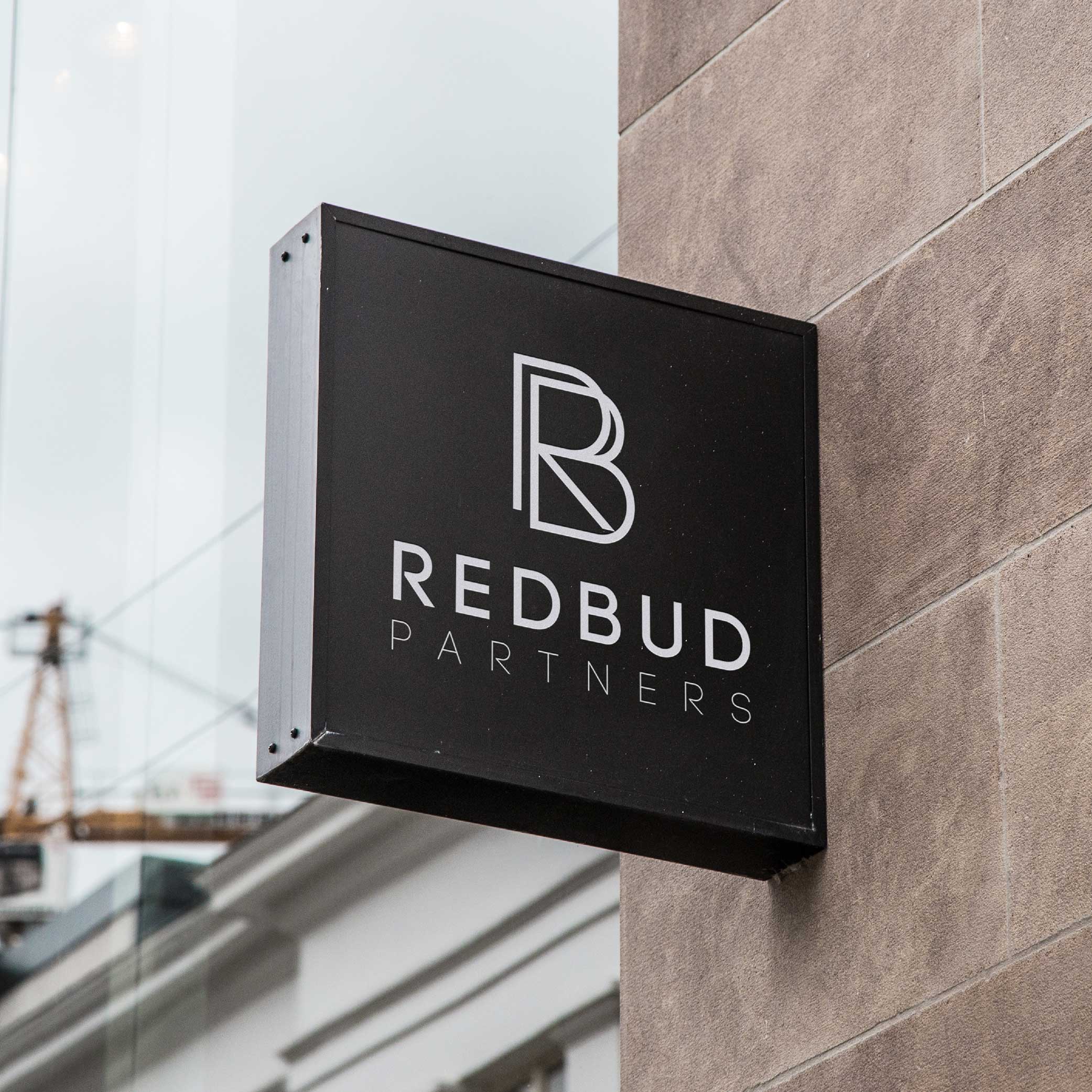
The geometric design, with bold lines, brings a modern, edgy style to the brand. It’s complemented by a recognisable icon moulding the letters R&B to flourish as the ‘bud’ of the identity.
Initial Concepts


